Overview
Redesigned the app experience for creating and completing digital forms. The application supported a wide range of use cases, from field data collection to generating estimates for construction projects.


Redesigned the app experience for creating and completing digital forms. The application supported a wide range of use cases, from field data collection to generating estimates for construction projects.
Lead UI Designer
4 Months
The original mobile application presented several barriers to entry due to its complex onboarding process. Users could only build forms on the desktop platform, leaving the mobile app limited to the final step: filling out and submitting completed forms. This separation caused confusion and hindered the overall user experience, especially for users working in the field.
Introducing the ability to build forms directly on mobile aimed to streamline the workflow, eliminate the need to switch between devices, and allow users to make quick edits and changes on-site.
In addition, the app’s interface and branding were outdated. A visual refresh was necessary to modernize the product and create a cohesive experience between form-building and form-filling, all while simplifying the overall design.
I started by analyzing how users perceived and interacted with the mobile app in its current form.
With prior user testing already completed, I focused on reviewing those findings alongside a competitive analysis of other mobile form-building apps. This helped identify patterns, opportunities, and pain points to inform the redesign direction.
Several key areas emerged as opportunities to create a more unified and intuitive experience:
I introduced a simplified color palette to bring clarity and consistency across the app. The primary blue guides users’ attention toward critical actions, while neutral and secondary colors provide support without creating distraction. This intentional use of color helps prioritize interaction and enhances overall usability.
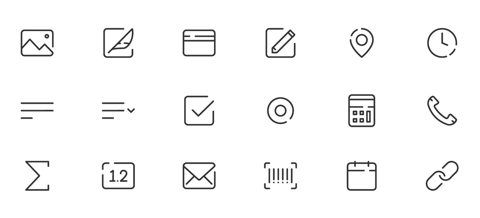
A newly designed icon set was introduced to unify the branding across both mobile and desktop platforms.
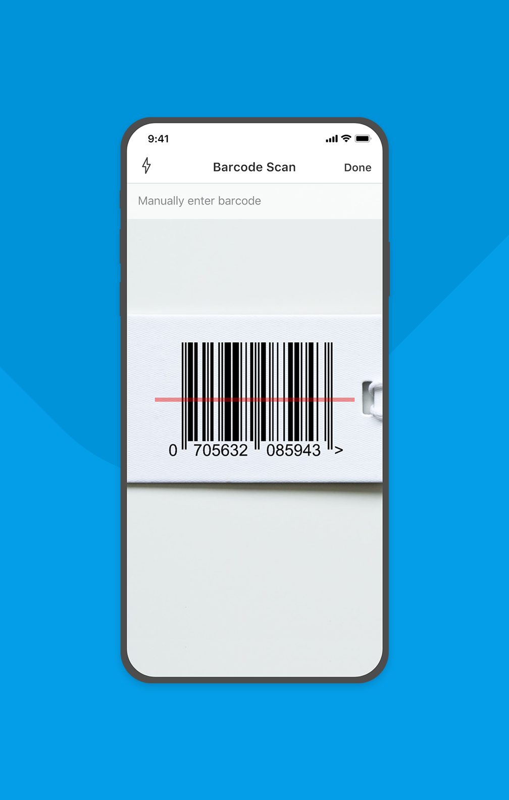
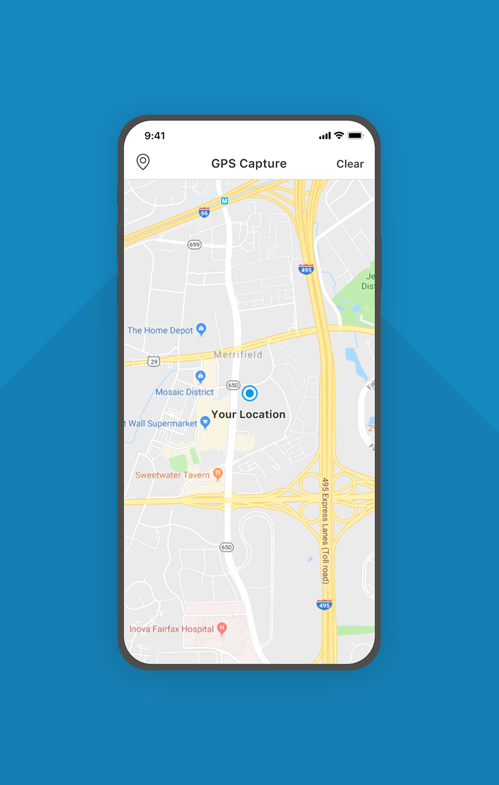
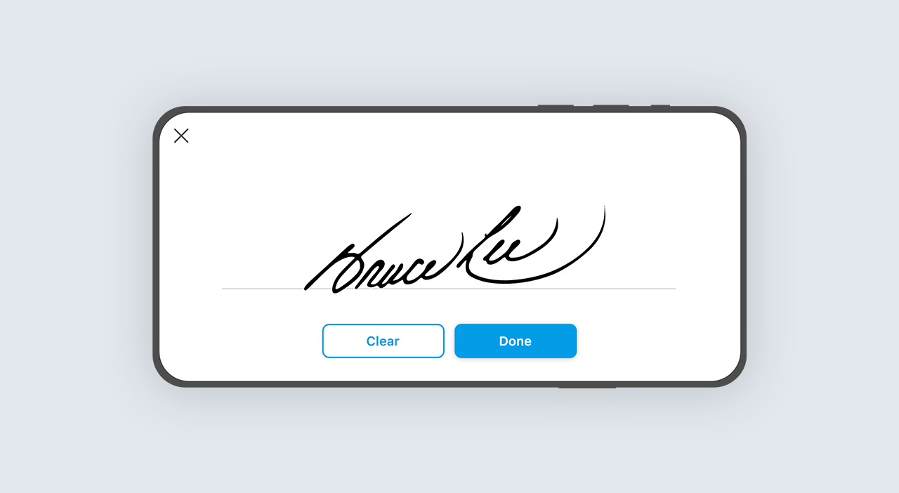
Existing features like Barcode Scan, GPS Capture, and Signature Capture were redesigned to utilize the full screen, enhancing visibility and ease of use. This update responded directly to user feedback highlighting frustration with cramped interfaces and limited touch areas.
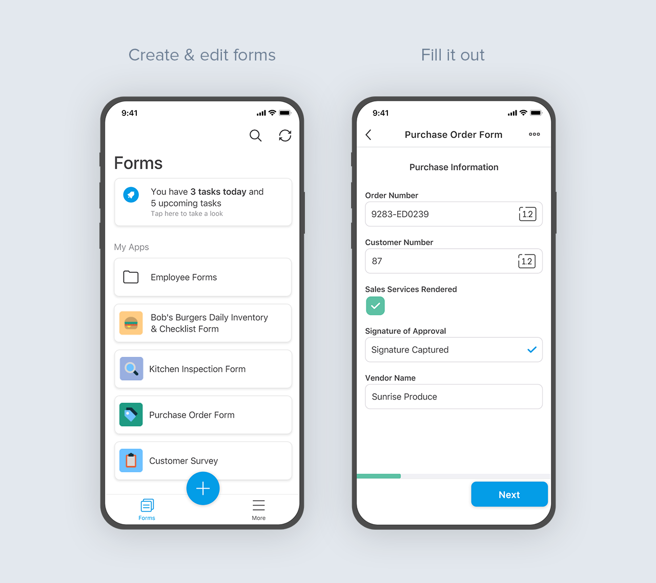
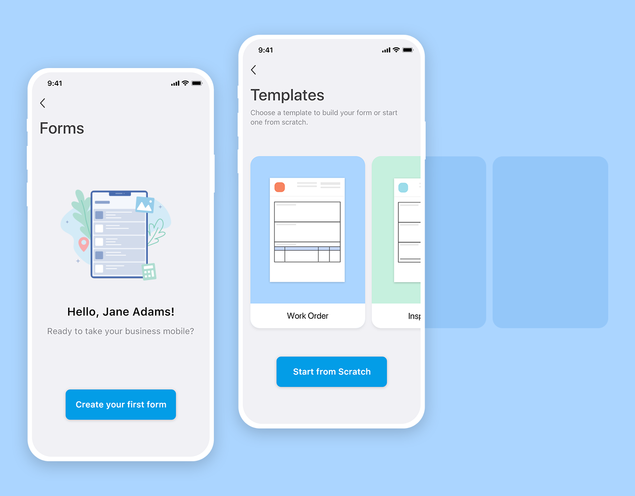
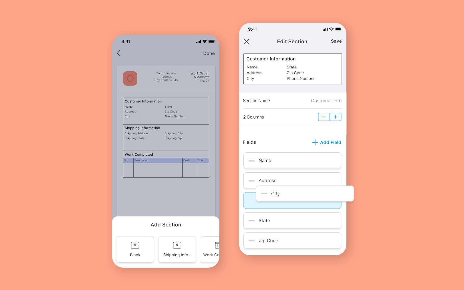
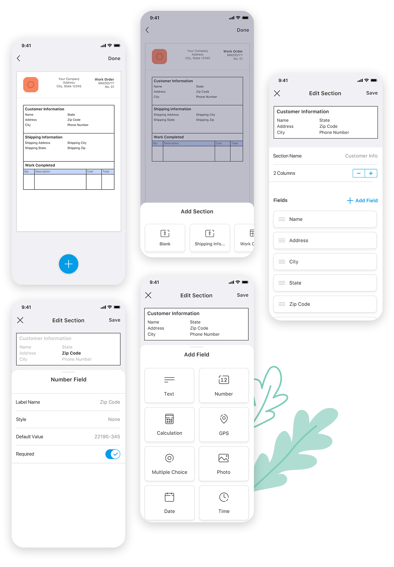
Previously, the form builder was limited to the desktop, while the mobile app only supported form completion. To unify the experience across platforms, a streamlined version of the builder was designed for mobile and tablet—enabling users to create, edit, and customize forms from anywhere.
Core features such as adding sections, fields, and editing columns were carried over to the mobile experience to maintain consistency. New capabilities—including ‘Start from Scratch’ and the ability to add blank, unpopulated sections—were introduced to give users greater flexibility. These additions empowered users to build custom forms more quickly and intuitively, helping them better understand and engage with the application.
Standardized iOS and Android font scaling was implemented to support dynamic text, making the mobile app more accessible and inclusive. Additionally, familiar platform-specific interactions and gestures were incorporated to align with users’ mental models and reduce the learning curve.
Over the course of several months, I developed a strong understanding of both iOS and Material Design guidelines. While platform-specific standards for font sizes, interactions, and gestures were used as a foundation in the early stages, I treated them as flexible guidelines rather than strict rules—adapting as needed to create the best user experience.
Collaborating closely with the development team was key to identifying technical constraints early. This partnership taught me how to think quickly, adapt my designs when needed, and strike a balance between design intent and implementation feasibility