Bullish is a cryptocurrency exchange operating in a fast-moving, high-trust market. As the product evolved, the marketing website needed to communicate new product capabilities while supporting multiple audiences, including traders, institutional partners, and prospective employees.
The Problem
Improving Website Clarity and Conversion
Bullish’s product had outgrown its web presence. As the exchange expanded, the site lacked the structure to communicate new capabilities with the clarity they deserved. Features went undocumented, layouts were inconsistent, and users were left to connect the dots themselves.
The Careers and About Us pages presented a subtler but equally costly gap. The employer narrative existed, but wasn’t engineered to drive action. Without clear visual hierarchy or well-placed entry points, the distance between a candidate’s curiosity and their application remained unnecessarily wide.
Design Process
UX and Content Audit
The work started with an experience and content audit to uncover what wasn’t working and where users were getting stuck.
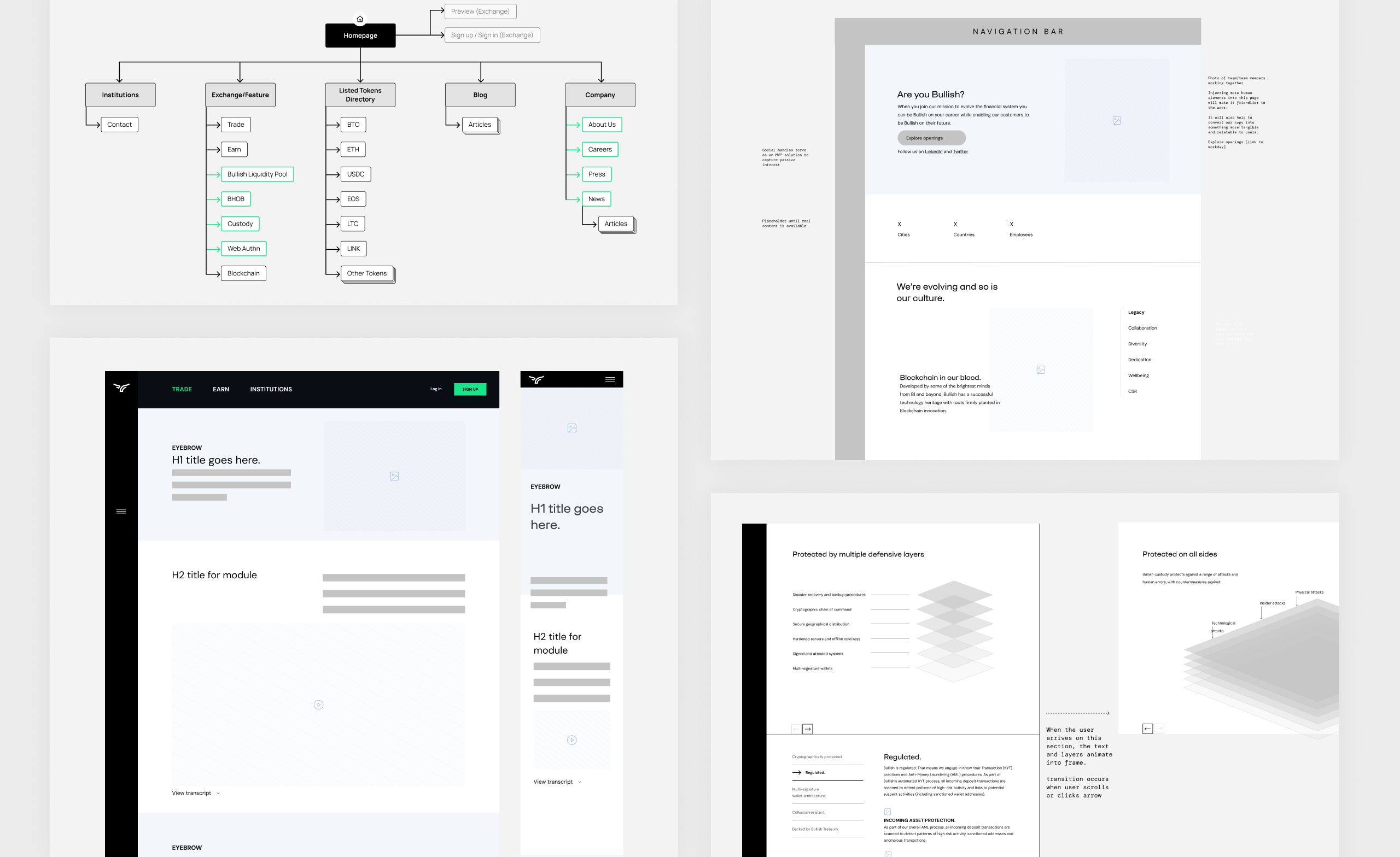
From there, the information architecture and content hierarchy were reworked to better support how people navigate the site. The team developed scalable patterns aligned with the design system, validated them through testing, and continued iterating after launch, leading to a smoother overall experience and stronger engagement.
Solution
Clarify & Convert
Make Abstract Concepts Tangiable
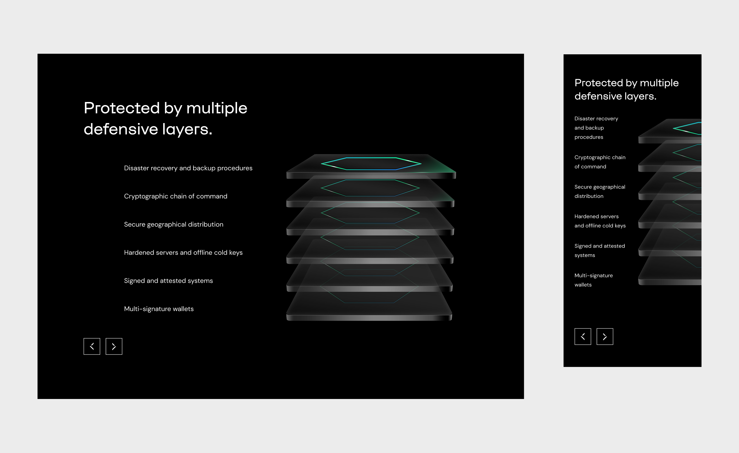
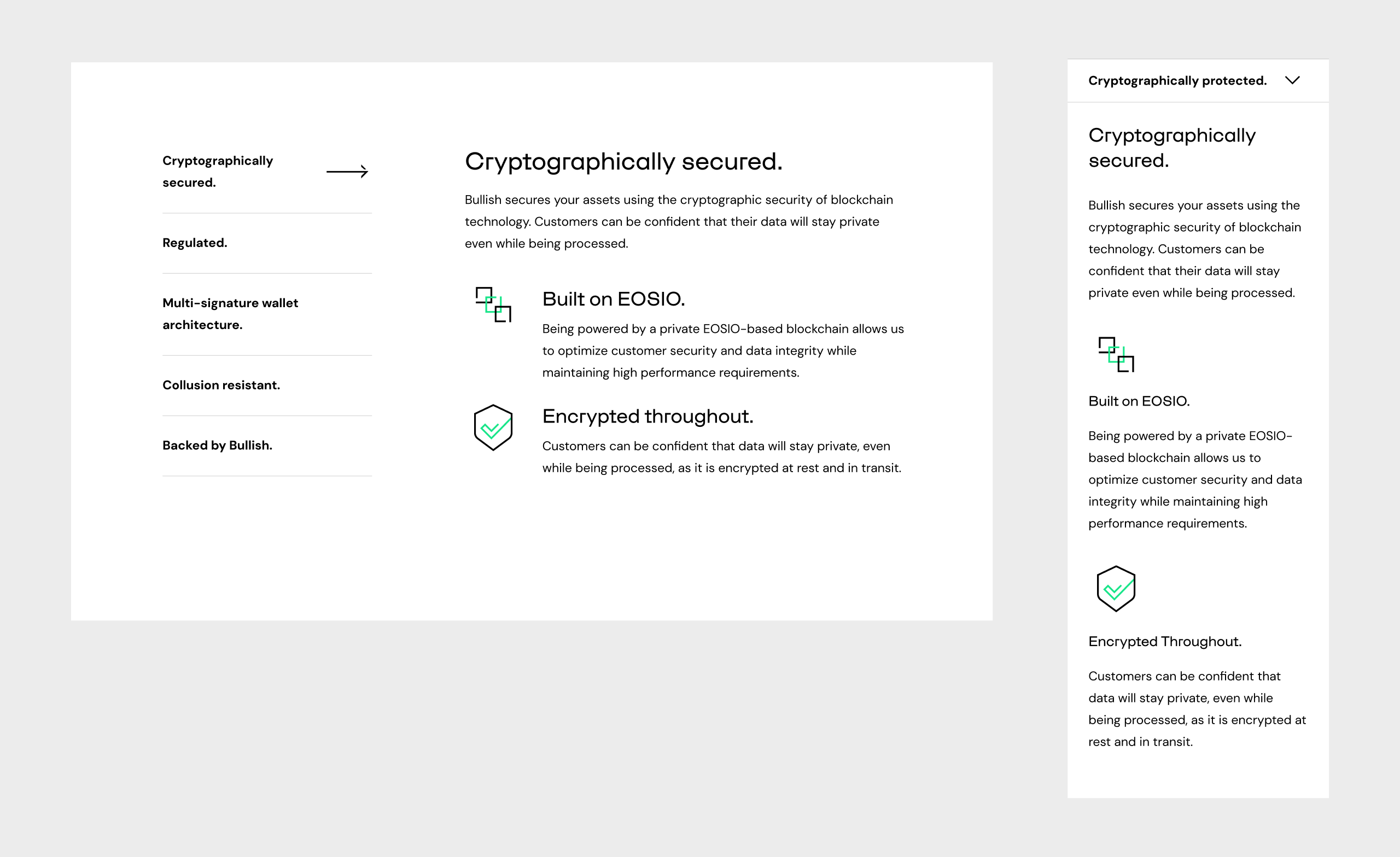
Each feature required its own mental model, and copy alone wasn’t going to get there. We introduced embedded videos and illustrations with motion animation, letting users grasp the concept before engaging with the detail. The page then built outward, an outcome-first headline, four discrete feature callouts that made the information immediately intuitive.
Video and visuals carried the weight. Copy played a supporting role.
Build Pages That Convert Culture Into Action
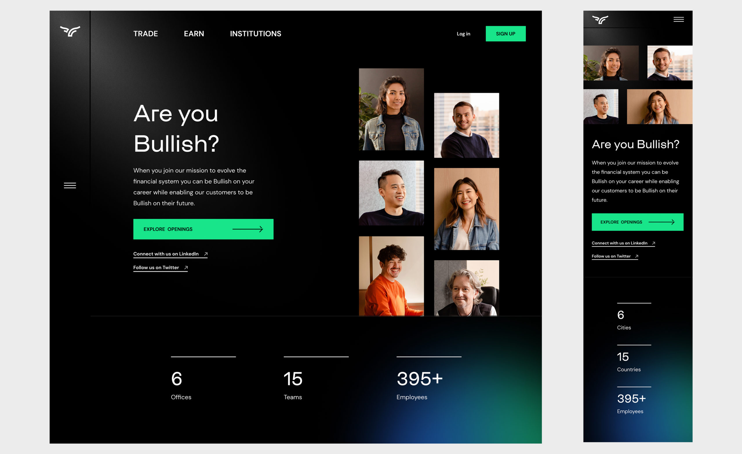
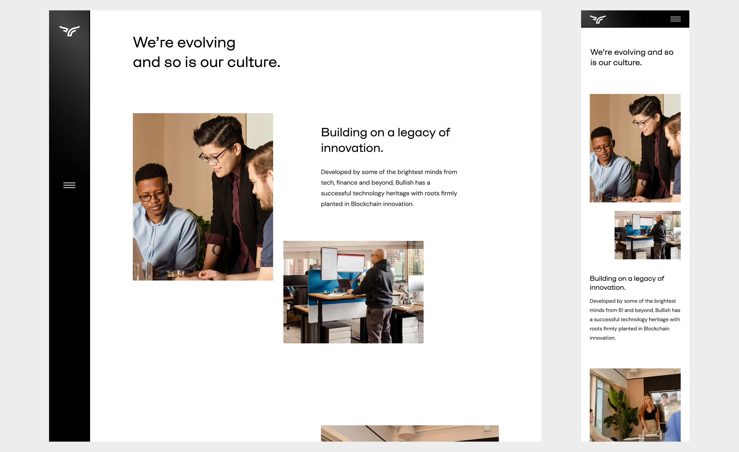
Both the Careers and About Us pages needed structural work before they could do their jobs. The About Us page was reorganized to surface Bullish’s mission early and clearly, giving users a strong sense of what the company stands for before getting into the detail.
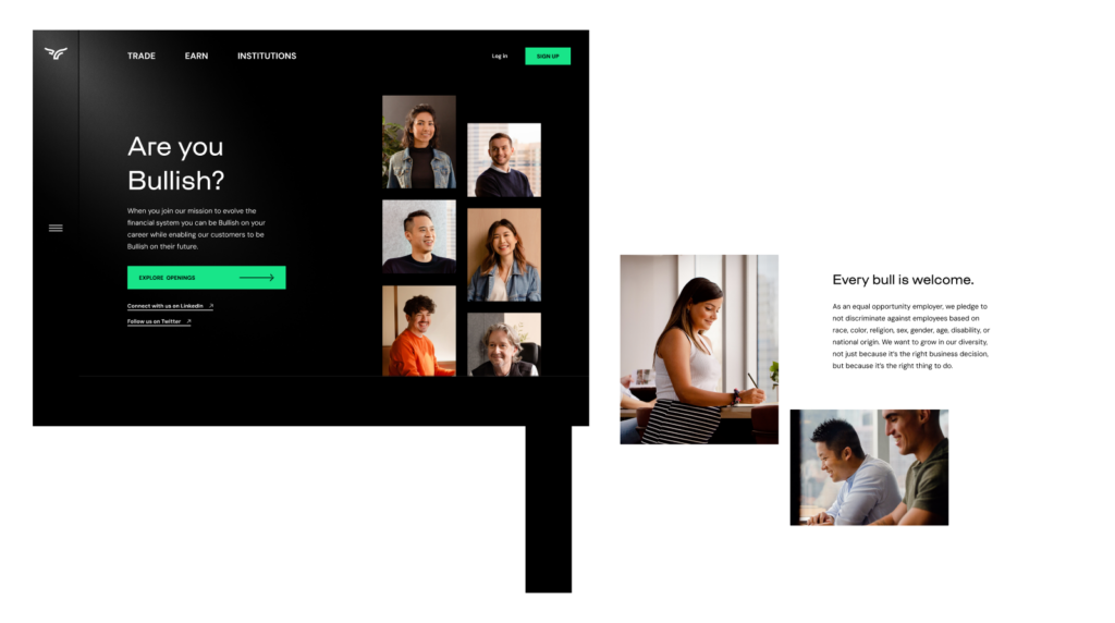
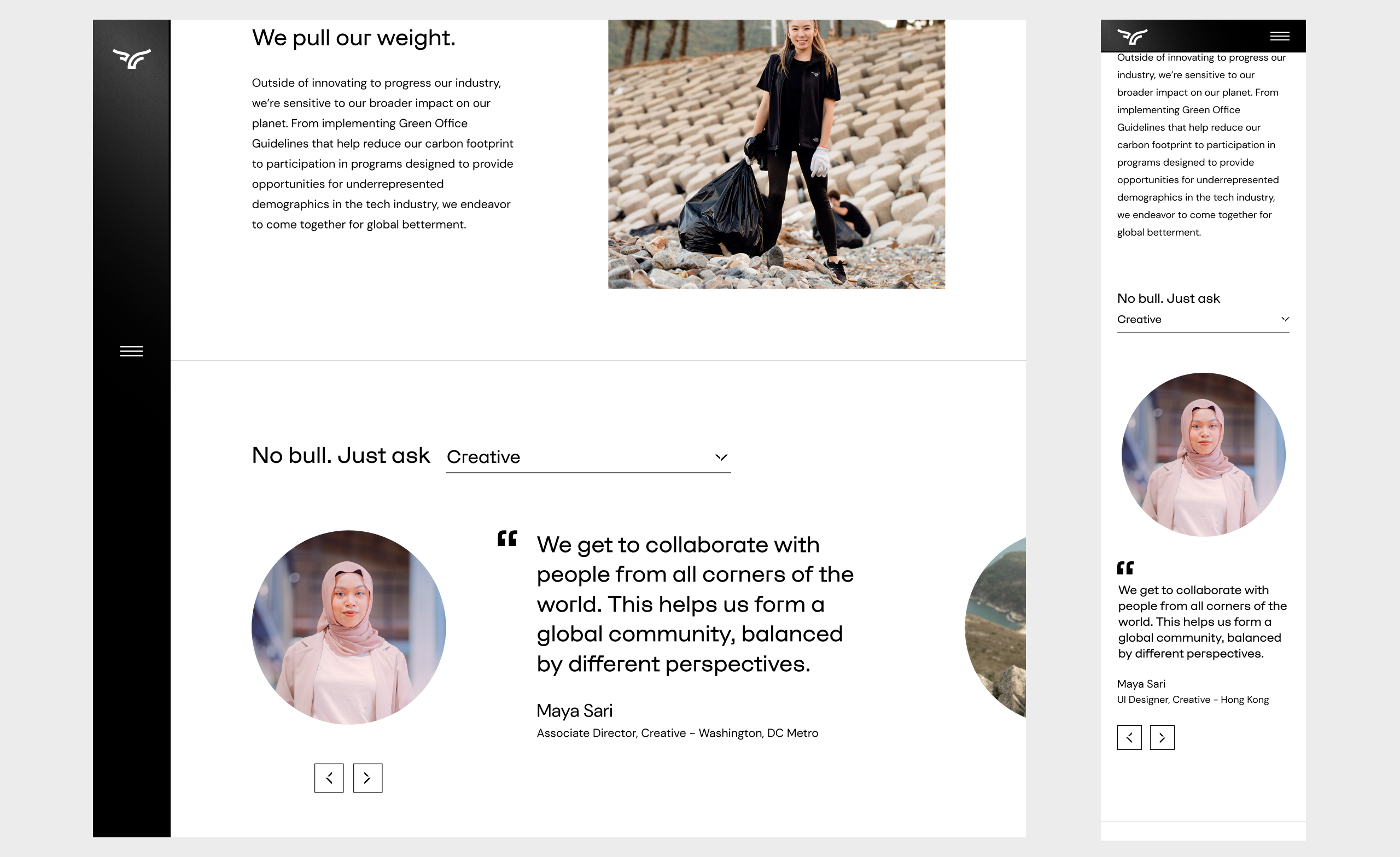
The Careers page took that foundation further, adding a cultural narrative and employee voices to humanize the brand, then restructuring the hierarchy to put “Explore Openings” front and center rather than buried at the bottom.
System & Documentation
Laying the Foundation
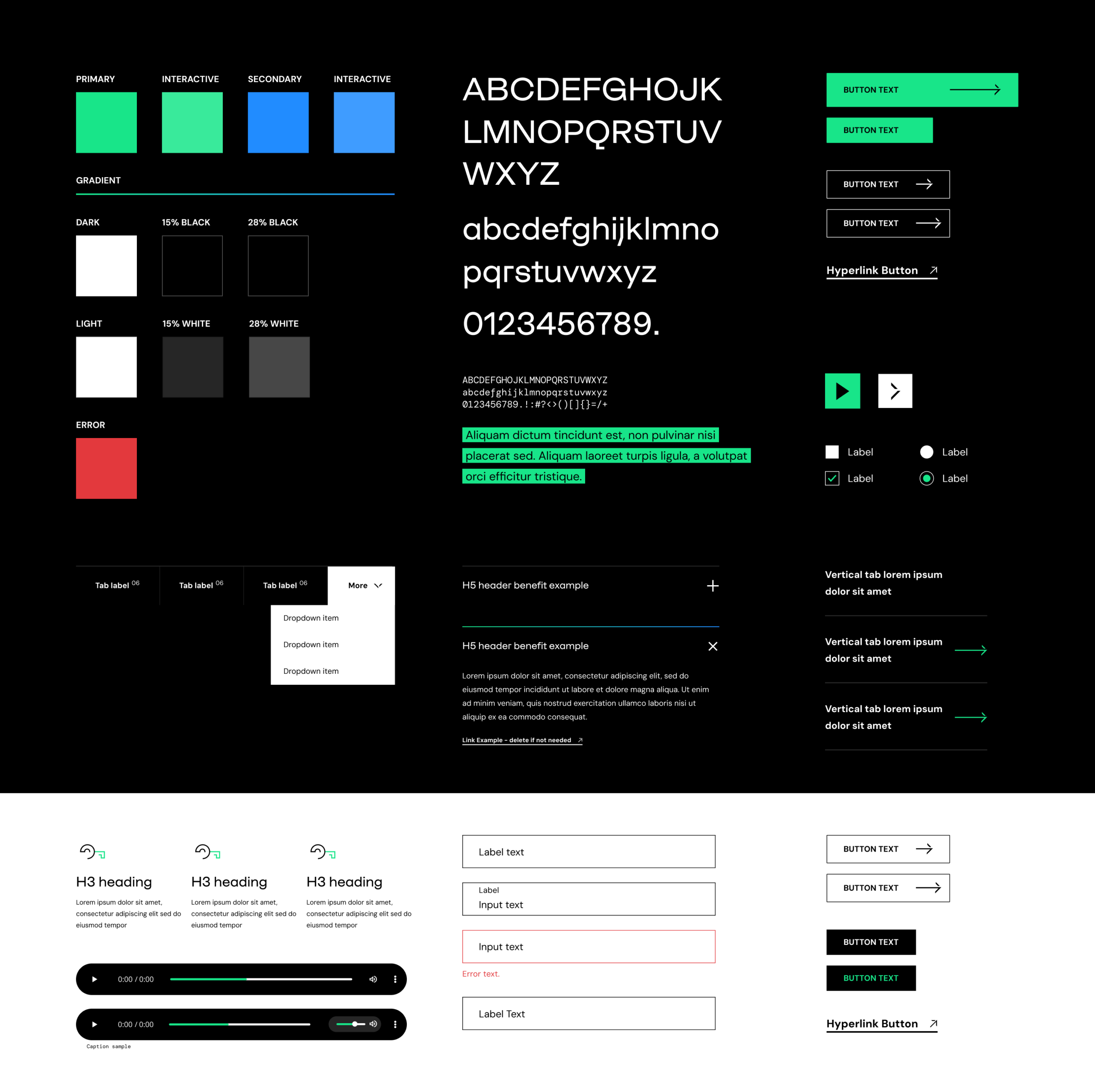
As the website expanded, inconsistencies across layouts and components made it harder to scale new pages efficiently. Building on existing visual patterns, I helped evolve the website’s design system in Figma, formalizing reusable components, layout structures, and interaction patterns that had previously existed in an ad hoc state.
The result was a shared foundation that gave both designers and engineers a reliable starting point for new pages. Rather than solving layout and component decisions from scratch each time, the team could build with confidence using established patterns, making the system as much a collaboration tool as a design one.
Outcome
The work brought the website in line with where the product actually is, a sophisticated exchange that needed an equally considered web presence. Feature clarity, cultural storytelling, and a shared design system gave the team a stronger foundation to build from as Bullish continues to grow.
The updated careers experience clarified the path from discovering opportunities to applying, while the design system provided a reusable foundation for future website growth. Motion and interaction design reinforced hierarchy and navigation, resulting in a more cohesive and responsive website experience.